Whilst brainstorming with my group about out ideal aesthetic for the summer show, we all agreed that we wanted it to look clean and professional. It was suggested that we make it similar to most professional exhibitions, with things clearly labeled and bio’s of each student. We thought white would be the main color and a few accent colours in the wayfinding and exhibition guide.


Although these images showcase the work in different ways, this shows the level of simplicity that we had in mind. Another suggestion was to use wood to help display the work, like wooden crates for example.
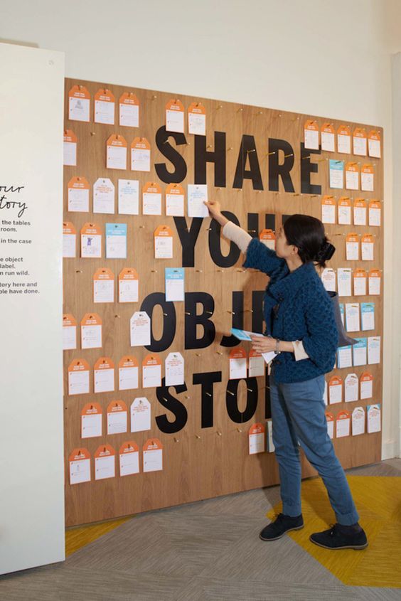
We also thought it would be fun to have a section where you could leave a comment or answer a short question. This adds an interactive aspect to the show, that most people love. It also makes you feel like your adding something to the exhibit itself.
Images are taken from Dezeen, More Publishers, Grafik
