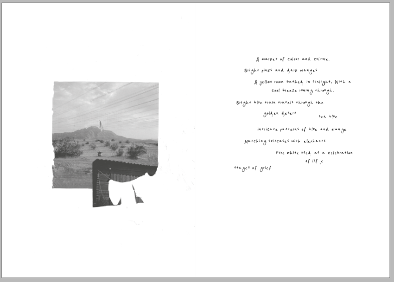
After looking at Fiona Banner’s work, I had the idea of using my own handwriting and describing the colour of the film, then just placing that next to my collages. So I did several layouts in my sketchbook some using singular words, then this one having short sentences which I prefer.
But then it looked too jumbled and unrefined, which was not the design I was going for.
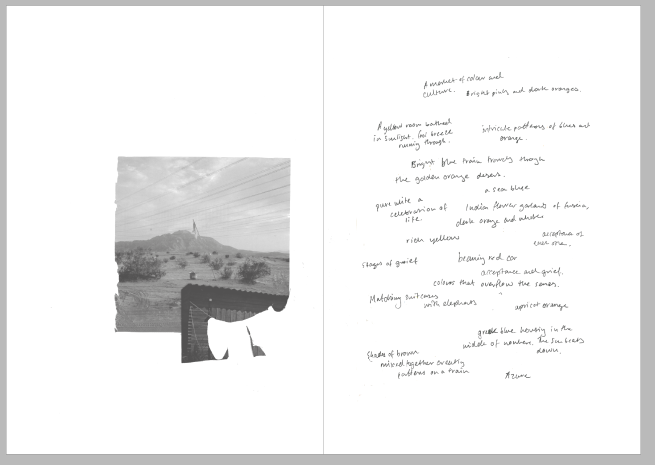
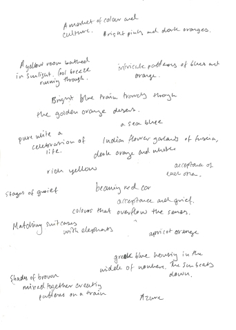
So I thought I make a typeface from my own handwriting, which look far more interesting but I’m not too sold on it. I don’t know if it’s my handwriting or the layout itself. Maybe I’ll try and find a typeface that suits the collages better.